BLUEBOARD
BLUEBOARD
Marketing + Design Associate assignment
Hunter McLean
DIGITAL BANNER ADS
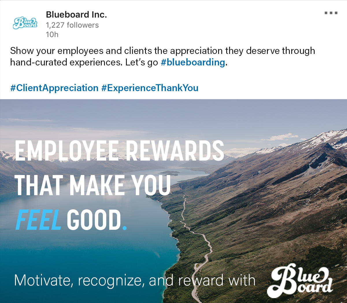
With the professional audience of LinkedIn, I wanted to use more empathetic wording to standout from the "business" noise, while displaying a unique advantage Blueboard has over other employee reward providers.
With the professional audience of LinkedIn, I wanted to use more empathetic wording to standout from the "business" noise, while displaying a unique advantage Blueboard has over other employee reward providers.
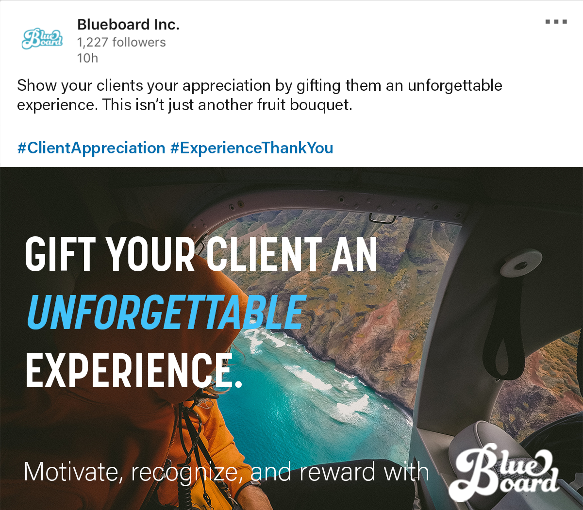
The ad, as well as the caption, highlights the uniqueness of Blueboard in a few different ways. With people picking their brains for a killer client gift, this ad could open a door to feeling like a rockstar gifter.
The ad, as well as the caption, highlights the uniqueness of Blueboard in a few different ways. With people picking their brains for a killer client gift, this ad could open a door to feeling like a rockstar gifter.
300x250
Using layers and bold text, this ad highlights the exciting advantage, and "wow" factor of Blueboard. This is intended to catch the attention of someone not necessarily looking to talk business while they're surfing the web. It also is leverageing #blueboarding and strong branding in the absence of the logo.
Continuing the theme of unforgettable experiences, this ad promotes the long lasting effects of a Blueboard gift on the overall client - gifter relationship.
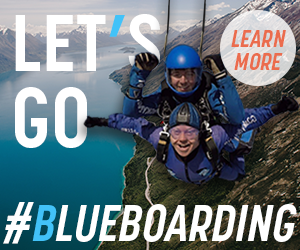
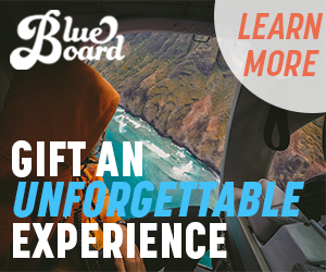
728x90
Further promoting the positive association between Blueboard experiences, and client relationships, the 728x90 ad creates intrigue while also displaying a widely appealing reward.


320x50
Maximizing the small space, a simple one-liner states what Blueboard does, and how it can help your business.
Building off the unforgettable experience campaign, the tag-line has been slightly shorted for this size ad.


BLUEBOARD WEBSITE
BLUEBOARD WEBSITE
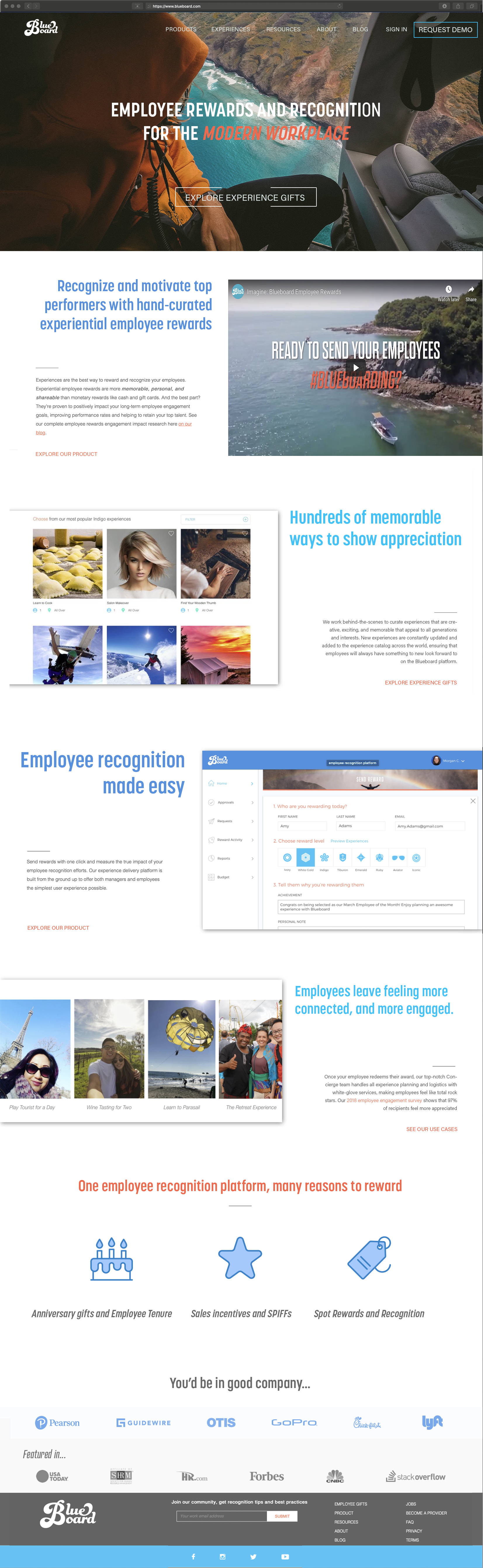
Landing page
Building upon the current landing page, there is room to improve the overall flow ad motivate the scroll through to the end of the page. Removing the client and pop-up boxes (not to be forgotten) gives the hero video some extra room to show how awesome Blueboard is.
Using stylized fonts and colors, the landing page can be the first taste of strong brand association.
A little extra space between sections was added for some added breathing room. Even with this additional space, the overall page length is shortened.
Some of the section headings have been tweaked to highlight the cultural advantages to using Blueboard. This is meant to showcase a different selling point at each section, and tells a complete story from what Blueboard is, to how it impacts your business.
After reading about all of the awesome advantages Blueboard provides, the customer is dropped off on a few examples easily displayed through some iconography.
There are those clients! Once the customer has learned about the value Blueboard will provide for their company, they can see the other stellar companies that are happy advocates.
Overview
To build upon the great content on the website, the design can be optimized to display a strong brand through typography and color. With facelift, the website will have more of the same look and feel as the interface when logged in. A global style guide for the entire website would strengthen the brand, as well as enhance the established professional appearance.
Streamlining information on the landing page is one method that could be used to promote scrolling to the bottom of the page. Removing some of the feature bars allowed for the primary content to be packaged together, and eliminates a degree of distraction. Overall, increasing scroll through rate could raise overall engagement by turning it into a strong one-page pitch. This could be reflected across the other pages as well by repositioning the testimonies, CTA, and social feeds. With streamlined information on each page, it may be easier for a potential customer to understand all of the benefits Blueboard provides.
The "resources" and "blog" pages could be combined or condensed into one page to increase interaction on both. The wealth of knowledge on the blog is a valuable resource so I think they would play well together on a page.
E-BOOK: BUILDING BRANDS
E-BOOK: BUILDING BRANDS
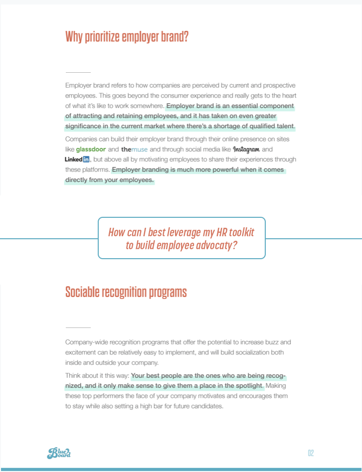
Like the website, elements can be tweaked in the E-book to encourage a reader to keep moving down the page. On a quick "scan" of this e-book the important question/content segue is less likely to be skipped over.
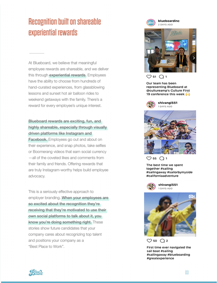
By replacing the picture with real social posts, the same message is conveyed while also showing the current success through relatable examples. The goal of this change is to increase lead generation by showing snapshots of what and why Blueboard works. Reading it is one thing, seeing it is another.
Thank you for taking the time to look through this project. I had a blast working on it, and look forward to hearing from you soon.